

A.M.S is our IT services business for small companies in Haifa and the Krayot. Until October 2026 it had a small six-page WordPress site that barely showed up on Google and described a business that no longer looked like that. On October 20, 2026 a completely new site, built from scratch, replaced it.
What this post is about: this is a portfolio post. It shows what a site we built for a local professional service business looks like, what is in it, and how the decisions were made along the way. It is not a case study with before and after measurements, because the old site is already gone.
What you will find here
- What existed before, and why we rebuilt instead of improving
- What the new site contains, page by page
- How the design was chosen, including the first direction that was dropped
- What you cannot see from the outside: accessibility, security and speed
- What any business that serves a specific area can take from it
Who this post is for: owners of service businesses (technicians, consultants, contractors, service offices) who are considering a new website and want to see a real example before they talk to anyone.
What existed before
The old A.M.S site ran on WordPress on shared hosting. It had six pages and presented the business from a completely different angle. It barely appeared on Google, so there was no traffic to protect.
In October 2026 the business itself changed. The new direction: managed IT services for businesses with up to 30 employees, with a steady team that knows the office, rather than a call center where someone different answers every time.
When the structure of a business changes, the structure of its website has to change too. Patching an existing site in that situation is like renovating a two-room apartment into a five-room house. We wrote a whole post about that decision: when to renovate a website and when to rebuild it.
What we built
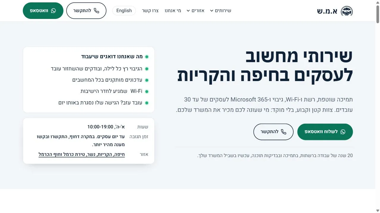
The new site is built around one question a business owner asks when the computers stop working: “Can you help me, and do you come to me?” So it has three layers:
- A page for every service. Ongoing support, networks and Wi-Fi, backup, Microsoft 365, office setup, equipment procurement and servers. Each page explains exactly what is included, who it is for, and the common questions.
- A page for every city. Haifa, Kiryat Ata, Kiryat Bialik, Nesher, Tirat Carmel and Atlit. Someone searching for “computer support in Nesher” lands on a page about Nesher, not on a generic one. We wrote about this approach in our local SEO guide.
- Two languages. Every page also exists in English, at the same path with an /en/ prefix. Haifa and the Krayot have quite a few businesses whose owners or staff prefer English.
On top of that the site has an About page, a contact page with a form, a blog, four legal pages, and an AI rep that answers questions in Hebrew and English based on what the site says, and hands over to WhatsApp when a person is needed. More about it on our AI rep page.
And one more decision worth showing: prices are not published. The price of IT services depends on the number of workstations and the scope of work, and a price shown on a site without context confuses more than it helps. Instead, the site says exactly what happens next: an intro call, then a written quote.
The design: the first direction was dropped, and that is fine
The first version used cream, dark navy and gold. It passed every check and was right on paper. But once it was live, it did not feel right for the business. So we prepared three new directions, all with contrast that meets the accessibility standard, and picked the one we called “all green”:
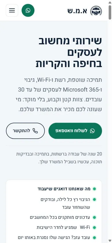
- A white background, dark navy for text, and green in the lead role. Green was not a matter of taste. It is the color of a status light that says “everything works”, which is exactly what the business sells.
- No photo of the owners up top. Instead of a photo, the top of the page lists what the business keeps working: the backup runs every night and gets tested, updates are installed, the Wi-Fi reaches the meeting room.
- A consistent series of illustrations. Every service and every city has an illustration in the same style. They were generated with an AI tool and are decorative, so screen readers skip them.
What you cannot see from the outside
Most of the work on a site like this is invisible, yet it decides whether the site works:
- Accessibility. An automated scan of every page in both languages, at phone and desktop sizes, returned zero errors. After it we ran a manual keyboard check and fixed everything it found. The accessibility statement says openly what has not been tested yet, such as a screen reader. We explained why that matters in our post on automated scores and compliance.
- Security. The site tells the browser to run only its own code, and the contact form filters spam attempts and malformed requests. On the site of a business that sells IT security, it cannot be any other way.
- Shabbat. The site closes automatically on Shabbat and holidays by Haifa times and reopens after Shabbat. Here is how that works behind the scenes.
- Fridge magnets with a QR code. The business hands out magnets, and their code goes through a short address that counts scans without storing anything about the person scanning. That is how we know whether the magnets work at all.
The numbers
We measured the home page on October 20, 2026, launch day, with Google PageSpeed: three runs per device, taking the median. Why a median and not a single test.
| Home page | Mobile | Desktop |
|---|---|---|
| Performance score | 97 | 100 |
| Largest Contentful Paint (LCP) | 1.8 s | 0.42 s |
| Total Blocking Time (TBT) | 0 | 0 |
| Cumulative Layout Shift (CLS) | 0 | 0 |
| Page weight | 244KB | 203KB |
| Requests | 19 | 20 |
The weakest number is not in the table: the Speed Index on a phone is 4.2 seconds, against 0.42 on desktop. We have not yet checked what causes that gap, and it is the first thing we will look at in the next improvement round.
What your business can take from this
If you provide a service in a specific area, three things from this site apply to you too:
- A page for every service and every area. Customers search for a solution to a specific problem in a specific place. One page that tries to cover everything answers none of them.
- Tell the truth about price. If you cannot publish a price, say why, and what happens after someone gets in touch. A customer who knows the next step reaches out sooner.
- You do not have to be in the picture. If you are not comfortable on camera, you can build trust through what you promise rather than through a photo.
Summary
A.M.S went from a six-page WordPress site to one built from scratch: seven service pages, six cities, two languages, an AI rep, and a 97 mobile performance score. The old URLs were kept, and the design was chosen after the first direction was dropped. It is a site that does one thing well: it tells a business owner in Haifa and the Krayot exactly what they will get, and how to get in touch.
Want a site like this for your business? Tell us what your business does, and we will come back with a direction and a quote.