
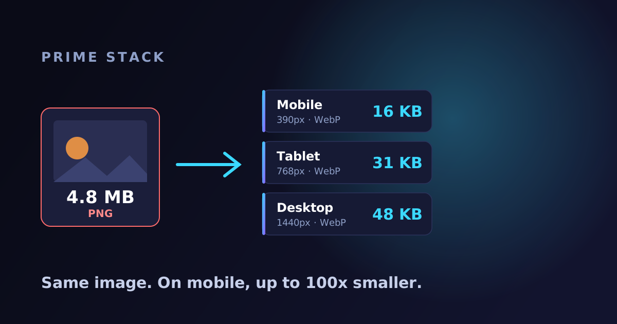
There is one thing that almost always explains why a site loads slowly: the images. Not the code, not the design, not the server. The images. A single photo straight from a camera or phone can easily weigh 4 to 5 megabytes, and when there are a few of them on one page, the visitor sits and waits for the screen to fill, in exactly the seconds they are deciding whether to stay.
The good news: on the sites we build, you do not have to deal with any of this. Every image that enters the site goes on an automatic “diet”, and the visitor ends up with a file that is smaller by a factor of several, sometimes a hundred times, without you doing a thing. Let us see exactly how.
First, what is a “heavy image”
Think of it this way: an image’s weight comes from two things. The first is how many pixels it has (the resolution), and the second is which format it is saved in. A 4.8 megabyte image is usually both very large in pixels and saved in a “wasteful” format like PNG.
The problem: that same heavy file is sent to every visitor, including someone browsing from a phone on a small screen and a slow cellular connection. They download four and a half megabytes to see an image that will display the width of a finger. That is waste, and it is exactly what Google “penalizes” in the speed score.
What we do automatically to every image
Three things happen behind the scenes, while we build the site, before it even goes live:
1. Convert to a light format (WebP). Every image, even one you uploaded as a heavy PNG or a JPG, is converted automatically to WebP. It is a modern image format supported today by every browser, weighing roughly a third to a quarter of what the same image would weigh otherwise, with no quality difference the eye can catch.
2. Generate several sizes from the same image. From every image we produce a few versions automatically: a small one for a phone screen, a medium one for a tablet, and a large one for a desktop. That way nobody downloads an image larger than what they actually see.
3. Let the browser choose on its own. The page’s HTML already contains all the options, and the visitor’s browser picks, on its own and in a fraction of a second, the smallest version that still looks perfect on their screen. The visitor almost never downloads the heavy original, only what fits them.
And all of this happens once, at build time, not on every load. After that the images are served from a global network of servers with a one-year cache, so even the first visit is fast and every one after it is nearly instant.
The real numbers, from this very site
We do not like talking in promises, so here are real examples from the site you are reading right now:
- Screenshots inside an article: an image whose source weighed 145 kilobytes is served on mobile as a 16 kilobyte WebP. Nine times smaller, the exact same image.
- The share image (what shows when you share a link on WhatsApp): it was a 299 kilobyte PNG, and it is now a compressed 31 kilobyte JPG. Bonus: above a certain size WhatsApp will not display the image in the preview at all, so the lighter file also makes the share look good.
- A heavy 4.8 megabyte photo: instead of the visitor downloading all 4.8 megabytes, they get a small WebP version matched to their screen, usually a few dozen kilobytes.
Wait, so how many times smaller exactly? It depends on the image, and it is worth being precise. The first two examples above started from files that were already fairly light, so the saving is nine to ten times. A genuinely heavy image, like a several-megabyte PNG (usually a screenshot or a graphic), shrinks far more, and on mobile even a hundred times or more. The trick is that we do two things, not one: we convert the format (that alone already saves a lot, since PNG is a wasteful format), and we shrink the resolution to the device. The format change alone gets you roughly 20 to 35 times. Resizing down to a phone screen is what multiplies it up to a hundred. So the heavier the source and the smaller the screen, the bigger the saving.
Wait, what is Astro?
A lot of this magic comes from the technology we build in, called Astro. Simply put: Astro is a way to build “lean and smart” websites. Instead of loading a lot of unnecessary code into the browser, it sends the visitor only what is needed, and prepares every image in advance in its lightest version.
Think of it like ordering food: a regular site brings you the whole kitchen, the utensils and the cooks, even if you wanted one dish. Astro brings only the dish you ordered, so it arrives faster. That is one of the reasons the sites we build reach unusually high speed scores.
”But I already optimize images”
Many business owners, and quite a few site builders, are sure they already do this. Sometimes they do, and often only partly. The difference with us is that nothing here depends on someone remembering: the conversion, the sizes and the smart selection all happen automatically for every image.
And not only that. We built a “guard” into our sites that runs every time we publish an update and simply refuses to publish if a heavy image accidentally slips in and bypasses the process. That way a silent failure, the kind that surfaces two months later when the site is already slow, simply cannot happen.
Why all this matters for your business
- ⚡ The site loads faster, and that is the first thing a visitor feels.
- 📈 It helps your Google ranking, since speed is one of the ranking factors.
- 📱 It works well on older devices and slow internet, because there is less to download.
- 😊 Less bounce, because visitors do not flee out of impatience while the page builds.
Bottom line: images are usually the heaviest thing on a page, so handling them well is one of the most meaningful things you can do for a site’s speed. With us it is not a plugin to configure or a step to remember, it is simply part of how we build, by default.
Want a site built this way from the ground up, or to find out why your current site loads slowly? Talk to us on WhatsApp through the site, and we will be glad to show you exactly where you stand.